


VIDEO and FREE TRIAL
Qlucore Omics Explorer video
Qlucore Omics Explorer free trial
Qlucore Omics Explorer is the powerful visualization-based data analysis tool with inbuilt powerful statistics that delivers immediate results and provides instant exploration and visualization. The program supports a broad spectrum of Omics and NGS data.
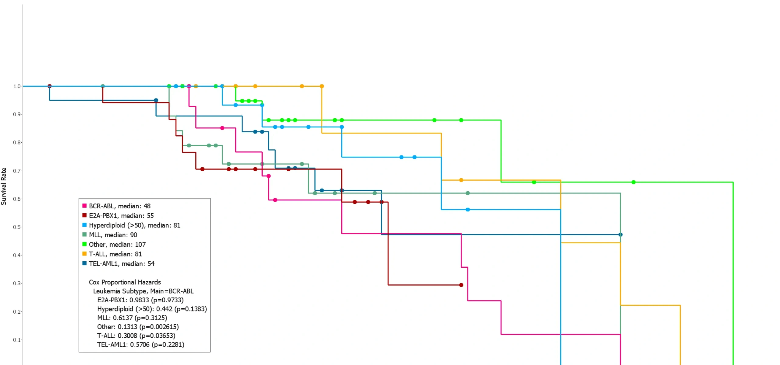
Kaplan-Meier plots are used to visualize survival data - showing how survival in a group of subjects changes with time.
Do you need to calculate survival and visualize it in a Kaplan Meier plot? With Qlucore Omics Explorer it is easy to set-up also plot types that have more complex data. Survival data is one example. The plot enables visualization of different subgroups survival and censor events are handled automatically. You have extensive freedom on how to analyze and visualize your data and the Kaplan-Meier curve plot can be combined with other supported plot types such as heatmap, Venn, PCA, box, bar, genome, and scatter plots.
It is straightforward to configure the Kaplan Meier curve plot for a layout that will meet your requirements and those of a potential reviewer. The Kaplan-Meier plot needs survival data as input. The Kaplan Meier survival curves shows and compares how survival in subject groups changes with different conditions (e.g treatments etc).
Additional statistical information can be added to the plot, see examples below:
Answer the four quick questions below and find out if you can use Qlucore on your data.
For more details about supported data formats and data import see Data Import or Contact us with questions.