Visualize
You can work interactively with any number of active plots from one or multiple data sets.
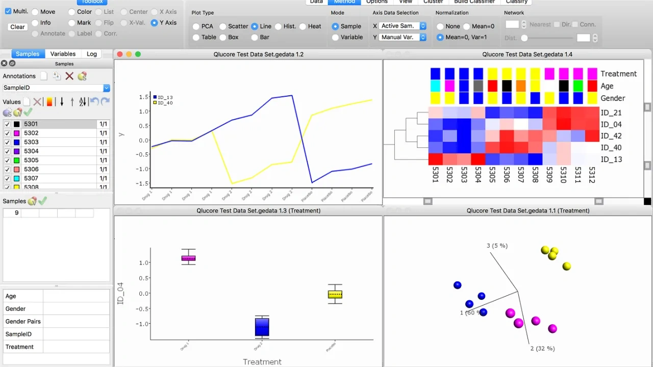
When you make any changes to selections and/or filters, the result is immediately displayed in all open plots. This makes it easier to visualize several aspects of data simultaneously, the plots can be enhanced by using colors, symbols, labels and networks
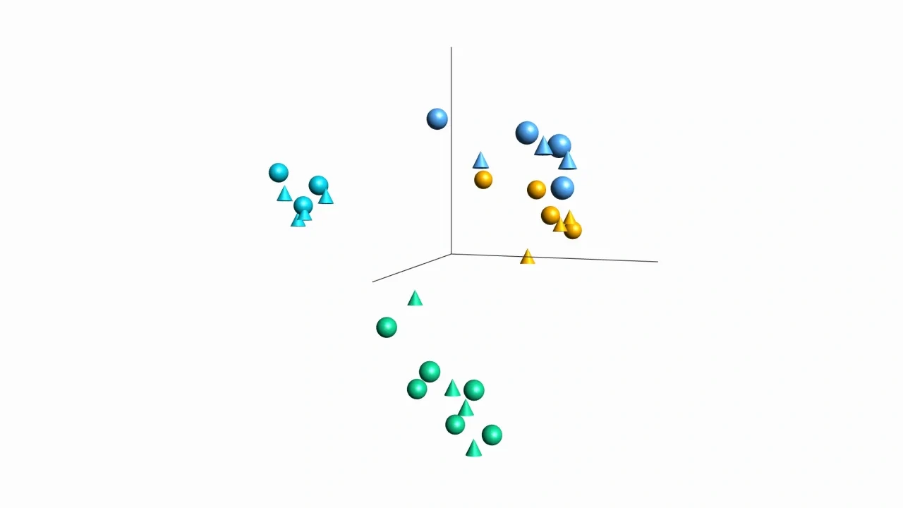
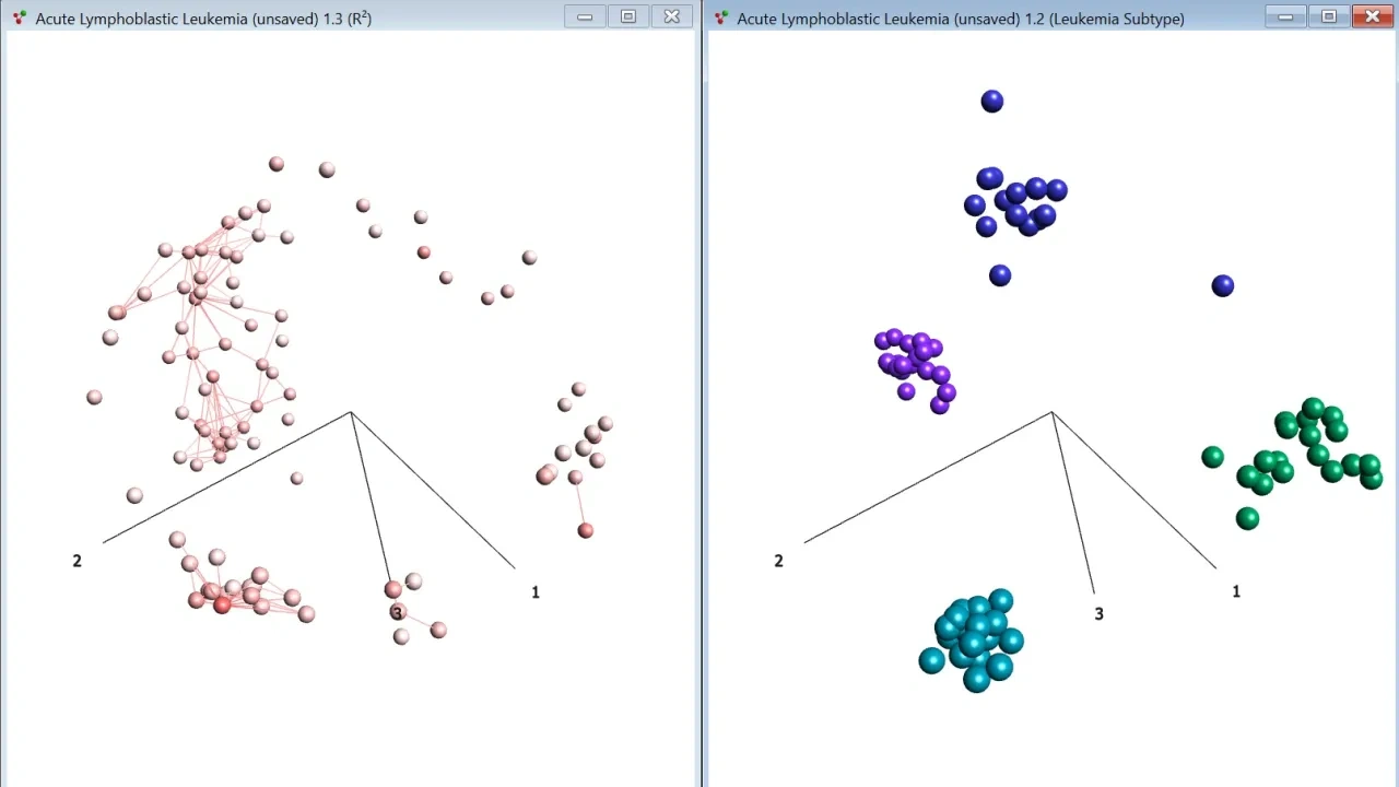
You can visualize multiple annotations at the same time both in 2D and 3D plots such as PCA using a combination of colors and symbols. That makes it possible to show two different sample annotations in the same plot.
The base module supports many different plot types that can be configured extensively based on needs and preferences.
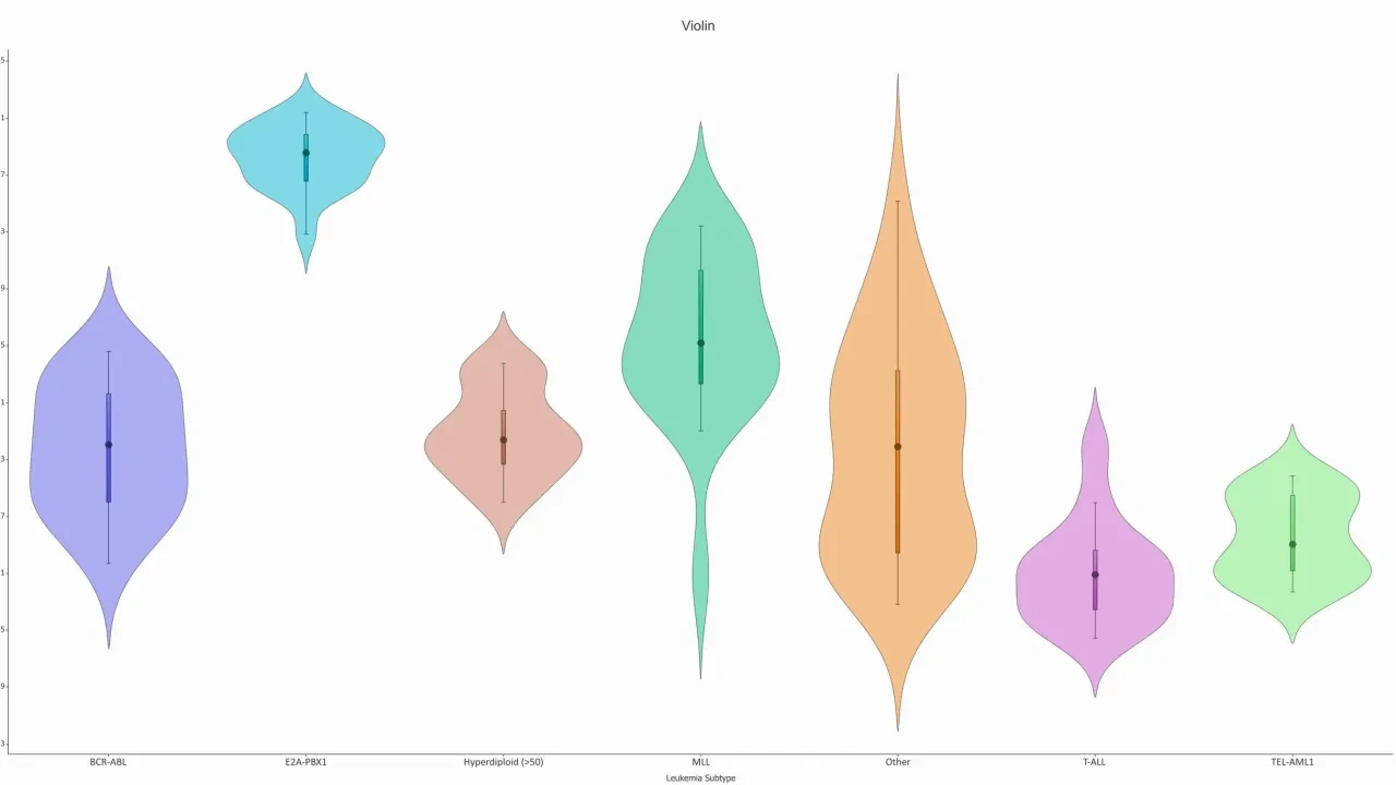
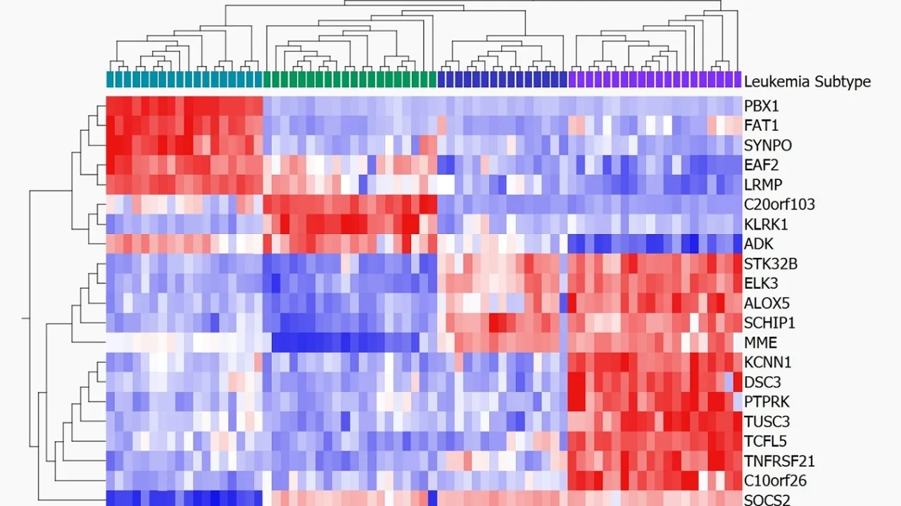
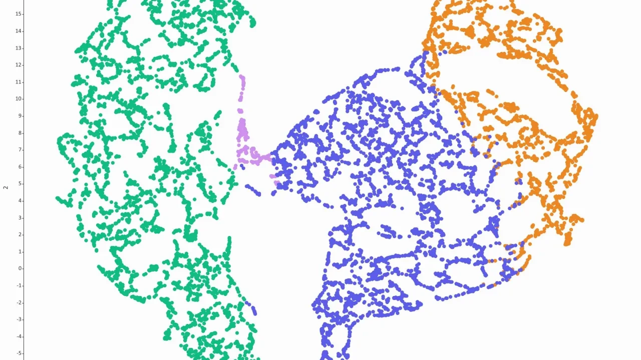
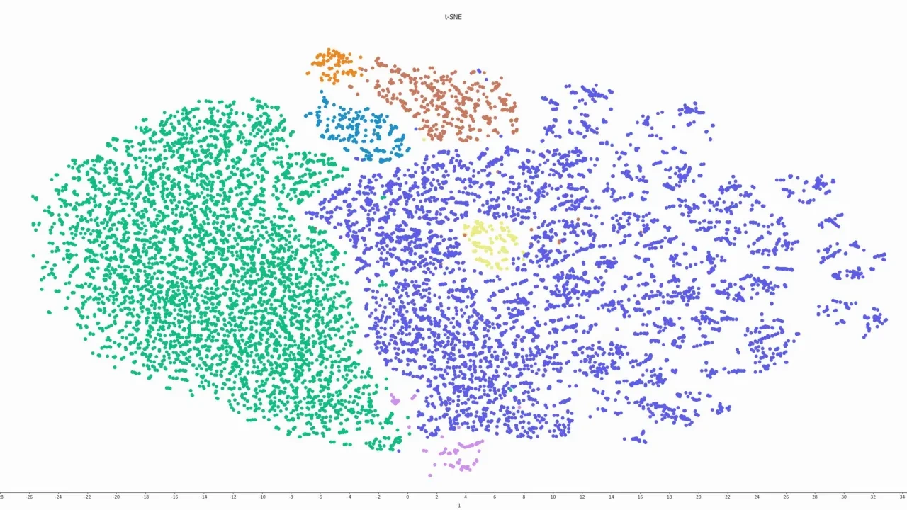
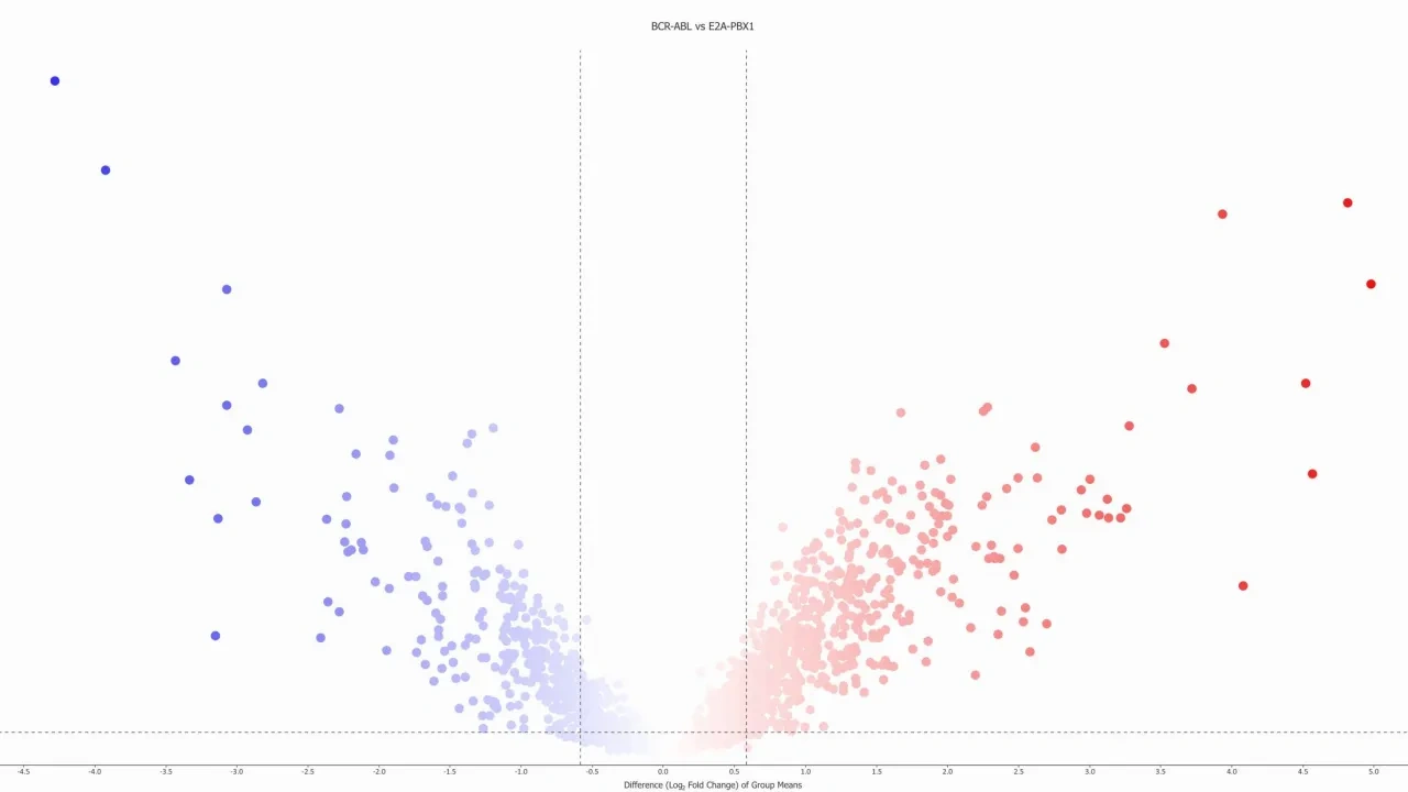
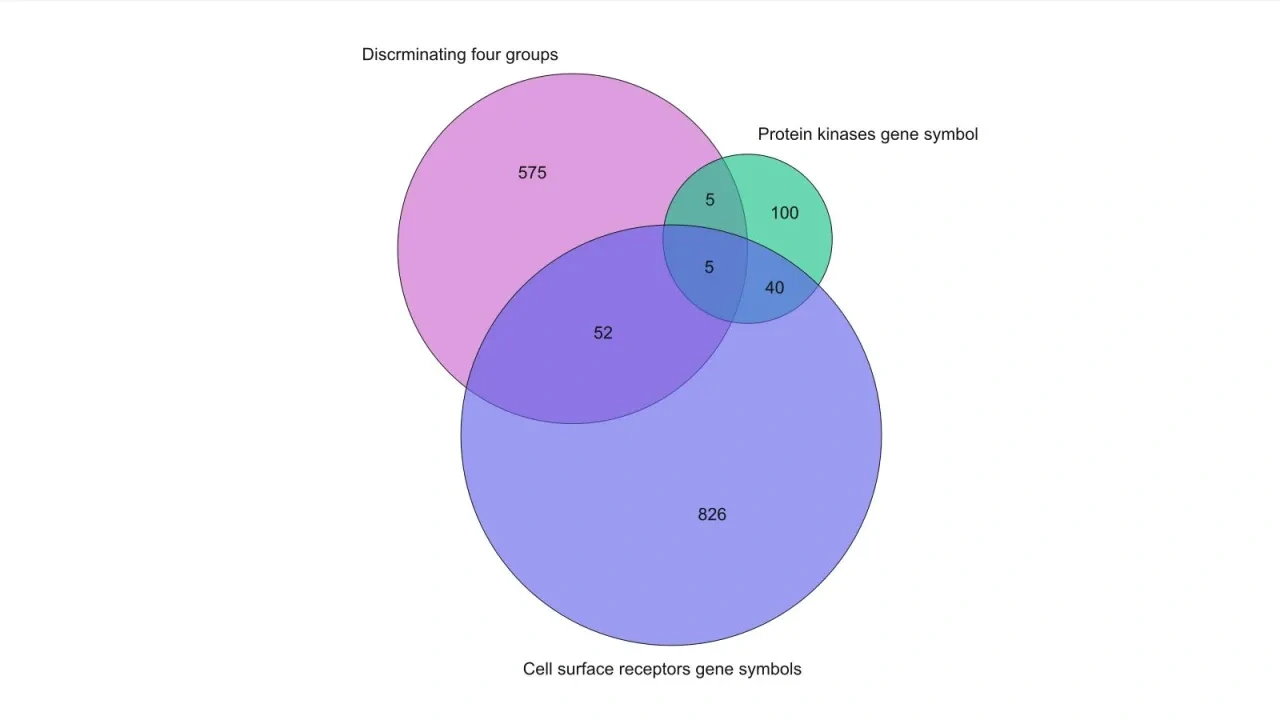
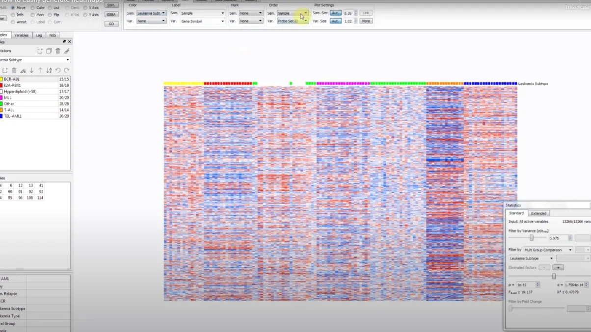
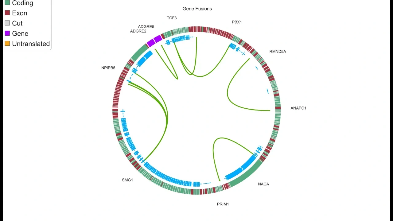
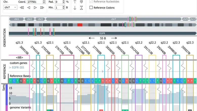
A few examples on available visualization. Click for full size.
The base module supports many different plot types that can be configured extensively based on needs and preferences:
- Sample and variable 3D PCA plots
- Heatmaps with hierarchical clustering
- t-SNE and UMAP plots
- Violin, Box, Bar, Line and Histogram plots
- Kaplan-Meier plots for survival analysis
- Venn diagrams and Pie charts. Sample and variable Scatter as well as Volcano plots
- Talus and Scree plots for dimensionality estimation
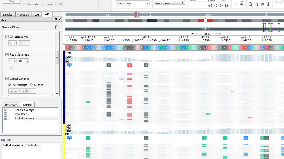
The NGS module adds a dynamic, flexible and fast Genome browser to the suite of plots. It also includes a Gene Fusion Workbench and gene fusions can be visualized both in the genome browser to examine the full sequence and with Circle plots.
You can work interactively with any number of active plots from one or multiple data sets.
When you make any changes to selections and/or filters, the result is immediately displayed in all open plots. This makes it easier to visualize several aspects of data simultaneously, the plots can be enhanced by using colors, symbols, labels and networks
You can visualhttps://qlucore.com/featuresize multiple annotations at the same time both in 2D and 3D plots such as PCA using a combination of colors and symbols. That makes it possible to show two different sample annotations in the same plot.
Read about all features in Qlucore Omics Explorer.
How to generate heatmaps
NGS module specific plots
The NGS module adds a dynamic, flexible and fast Genome browser to the suite of plots. It also includes a Gene Fusion Workbench and gene fusions can be visualized both in the genome browser to examine the full sequence and with Circle plots.
